Have you ever wondered how your customers are accessing your website? And are you sure your site looks good no matter where it’s accessed? Ensuring your website looks good is a cornerstone in digital marketing. That’s why today, we’re going to talk more about responsive design.
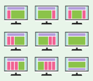
In the past, we’ve touched on standard responsive web design practices. But today we are going to give you a complete guide. We are going to learn why businesses prefer responsive design. And precisely what changes web designers implement and the different templates for sites. In essence, responsive designs are websites that adapt to the different ways people are accessing the website. These responses can take the form of scaling photos, changing font size, and even wholly separate landing pages! But why would you want to take on all of this extra work?
Why Use Responsive Design
Odds are, if you’re reading about responsive web design, you’re already considering using it. And who doesn’t want access to the most modern digital marketing tools? Responsive design creates a website that is ready to handle a wider audience. in addition to the reach, responsive websites are also sleeker and tend to look better because they tailor to the size of your users’ viewports. These changes are all minor ways to create a tremendous amount of utility from your website.

responsive design
This ease of use is one of the main advantages of a well-implemented responsive design. If your site is easy to access from multiple platforms and devices, you will likely see an increase in your performance metrics. Customers will actively notice responsive design features because they will feel natural and tailored to their setup. Your website is like your storefront, and you want it to be easy to access and inviting to everyone! This ease of use and quality all come from dynamic changes.
Dynamic Changes
Responsive design at the primary level is about implementing a website that changes with your users. But this process starts with allowing elements of your site to shift in response to your users’ ques. We’ve already talked about a few different kinds of dynamic changes; features like image scaling and viewport responses are all examples of a website responding dynamically to other users. These changes all require highly technical knowledge of back-end web programming. But they all work on fundamental principles of receiving inputs from users and reacting to data in pre-programmed ways.
Responsive programs are all about predicting the different ways users are going to interact with your site. Is a long block of texts too complex to read on some screens? You’ll need adaptive text features. Ensuring that you cover your customers’ most common use cases will guarantee high satisfaction. One of the most common types of predictive programming is creating mobile-specific landing pages.
Mobile Websites
Mobile websites are a common practice for businesses who want to reach a broad audience. Landing pages for specific mobile applications are a common first step in implementing a responsive website. Having dedicated landing pages for mobile versions of your site ensures your responsive web page will have fast load times. It’s most common to see these mobile pages exist for a lot of different hardware factors. Two of the most common considerations for a dedicated landing page are device size and OS.
Often, companies will design landing pages optimized for apple or android specific software. The best way to ensure this is to follow the developers’ most common practices for programming. By following android guidelines or apples, your website runs optimally on that platform, increasing your users’ engagement. Similarly, size-specific landing pages will ensure your text blocks and media are easy to process. Programming your responsive site can be intimidating, but using a predesigned responsive theme can be an excellent entry-level option.
Responsive Themes
In web design, professionals and hobbyists often turn to themes for their web designs. Themes and web designing software can take care of highly complex back-end work for you with ease. Modern web design applications like WordPress will have responsive features built right in! If everything we have talked about so far seems too complicated, a preset theme could be the option for you. in the past, we have talked about how easy WordPress is to use; And the responsive templates are no different.
responsive design
Responsive design is incredibly complicated, but the basics of it are now simple to implement. Even small companies are now implementing basic features like mobile websites. People want to access their content in their way, and your company should be ready for that. Responsive design makes it easier for your customers to engage, so implementing at minimum a responsive theme is vital for your online health.
Responsive Design
This blog did a deep dive into responsive marketing’s essentials and how you can make a responsive website. To start, we gave you good reasons to look into web designs that meet your customers halfway. And we covered topics like dynamic changes and mobile landing pages. We finished up by talking about some ways people can access responsive programming at the entry-level. Kallen Media can help if you’re looking for a web development company to help you through the transition. Reach out for a quote and make sure to mention our responsive design.